

1
[Street address], St. Louis, MO 63107
North City Office
1.2 miOpen now · until 5 pmMon–Fri, 9 am – 5 pm
STI testingSTI treatmentSubstance use counselingNaloxone
Choose a timeor call (314) [XXX-XXXX]
UX/UI designer / researcher
YJ Entertainment, a St. Louis live-music promoter, was losing pre-sales to the door. I redesigned how fans find, buy and get rewarded for early tickets, and cut the purchase path from 11 steps to 4.
Fans liked the shows. They just bought at the door. Low pre-sales meant YJ couldn’t predict attendance, plan staffing or see revenue until the night of the show.
Buying early took 11 steps: find the event on Facebook, follow a link out to Eventbrite, sign in or make an account, then check out. Some links were broken, and nothing rewarded buying ahead.
Before and after the redesign.
How might we make buying early faster, and more worth it, than buying at the door?
Over two weeks I interviewed 20 attendees at YJ events, then audited four ticketing apps. Three findings shaped every decision after.
Counts are interviewees out of 20, one answer each.
“How do you prefer to purchase event tickets?”
13 of 20 prefer a phone or online. The flow was the barrier, not demand.
“What makes you buy tickets ahead of time?”
Fans needed a reason to commit before show night.
“How do you usually discover events?”
Eventbrite added friction but almost no reach.
I audited the four biggest ticketing apps: Eventbrite, SeatGeek, StubHub and Ticketmaster, with a closer look at Ticketmaster, the most downloaded ticketing app of 2019 according to Sensor Tower. All four drew the same complaint: service fees that show up late.
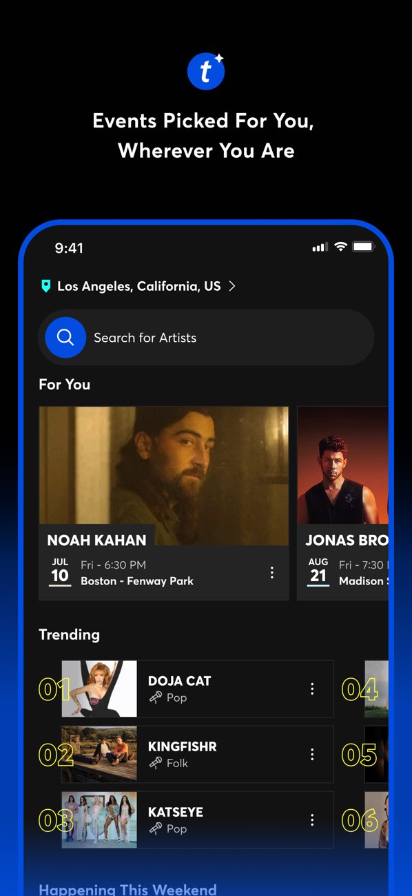
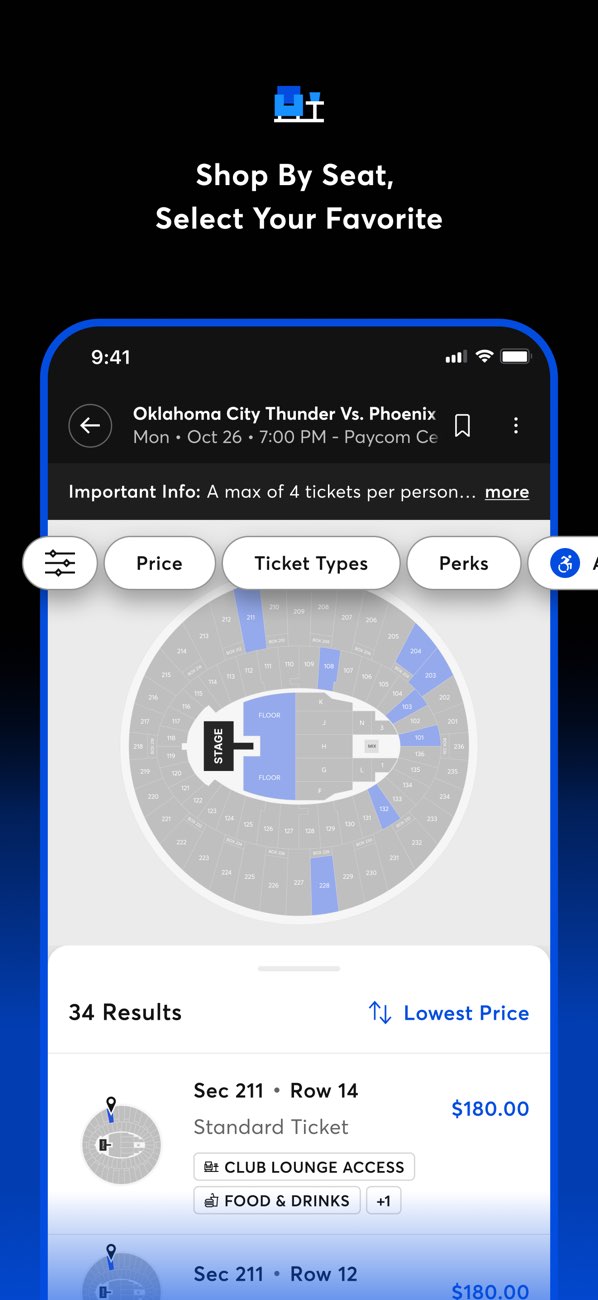
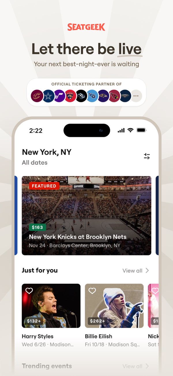
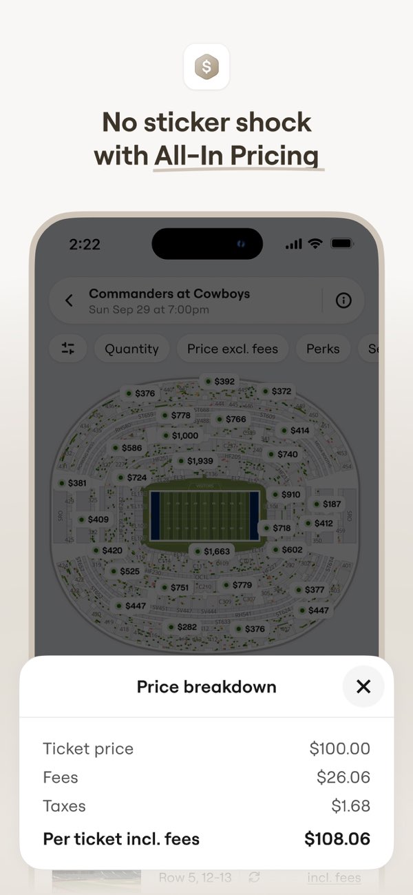
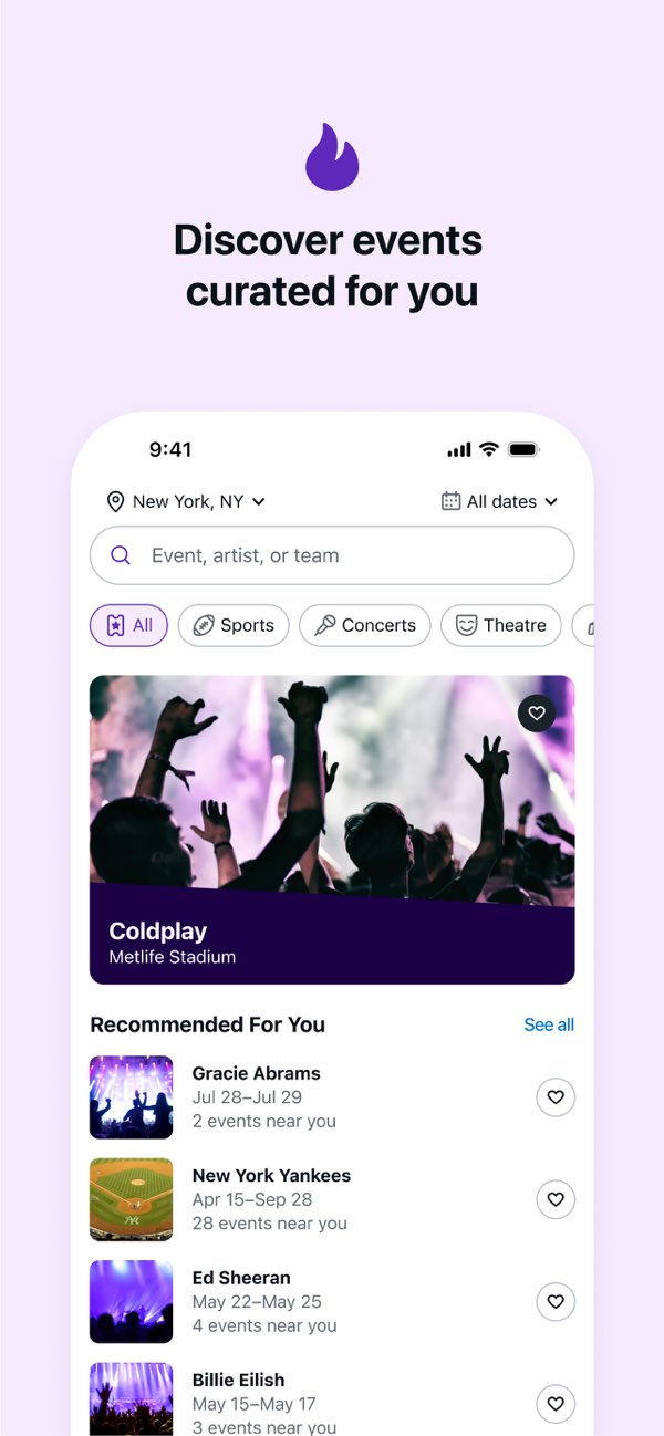
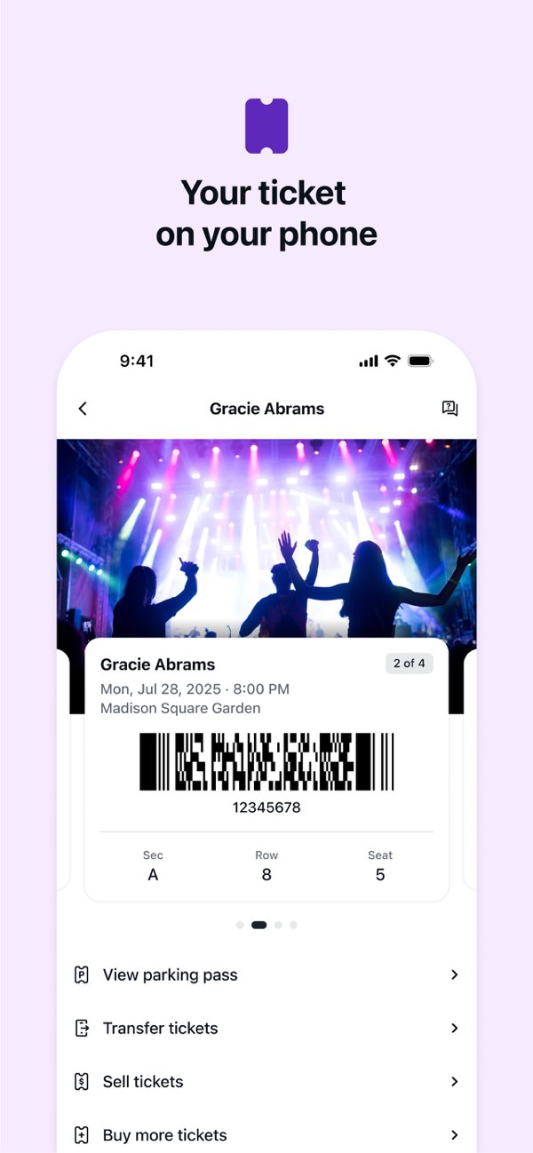
Simplified from the audit, done in 2020: the four apps added fees on the final screen. YJ shows every fee in the cart, before payment. Several of these apps now advertise all-in pricing.
What the audit recorded for each app.
| What fans need | Eventbrite | SeatGeek | StubHub | Ticketmaster | YJ redesign |
|---|---|---|---|---|---|
| Fees shown before payment | |||||
| Checkout without an account | |||||
| Same steps for every ticket type | |||||
| Rewards for buying early from a local promoter |
Buying early was slower than buying at the door, and it gave fans nothing extra. So the door won by default.
From the home screen to a ticket in the wallet, every screen moves the fan forward. The only branch comes after adding a ticket: check out now, or keep browsing.
Visually I kept YJ’s violet as the brand and action color, and added one yellow accent that only ever means “you save money.” Event art carries each show’s energy, so the interface around it stays quiet.
here’s the recap:
What I learned: I set out to fix a checkout. The interviews showed the bigger lever was motive: fans needed a reason to start buying early, not only a faster way to finish.
What I’d do next:
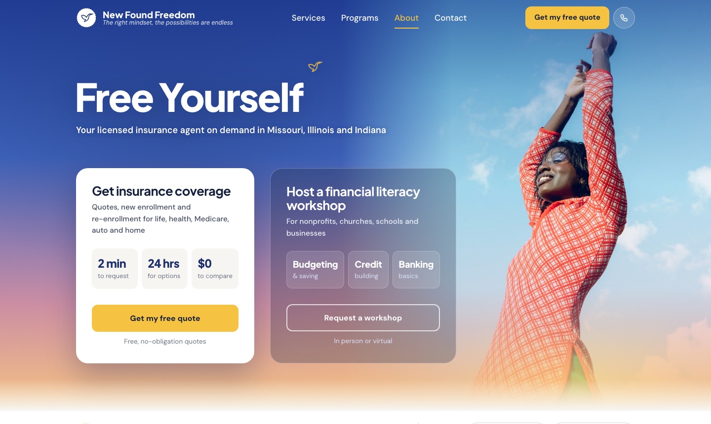
Online appointment booking for a St. Louis community organization that offers STI testing and substance use support. Before this project, the only ways in were a phone call or word of mouth.
Try the interactive prototype ↗ Book an appointment, then use “Staff sign in” to see the CRM. Sample data only.
Williams & Associates works within the St. Louis community on sexual health and substance misuse: STI testing and treatment, counseling, peer support and harm reduction.
W&A serves North and South St. Louis from two offices and a mobile outreach van, working mostly with uninsured and underinsured adults.
Phone-only booking puts the hardest step first. Someone ready to get tested or ask for help had to call during business hours and talk through a sensitive topic before anything was scheduled. Every booking also took staff time on the phone.
A two-week call log showed about 6 in 10 front-desk calls were to book or reschedule, and roughly a quarter came in when nobody could answer.
let people request care online in a few minutes, privately and at any hour, while keeping the human follow-up that builds trust?
| KPI | Why it matters | Target |
|---|---|---|
| Booking completion rate | Shows whether people who start booking can finish | 60% or more |
| Drop-off by step | Points to the screen that needs work | Under 20% at any step |
| Online vs. phone bookings | Measures the shift away from phone scheduling | 40% online within 3 months |
| Time to first contact | The confirmation screen promises one business day | 1 business day or less |
| No-show rate | Tests whether confirmation calls and reminders work | Under 20% |
Three inputs shaped the design: 6 conversations with staff who take the calls, 9 conversations with clients and community members, and a competitive review of how other health organizations handle online booking.
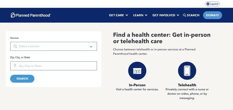
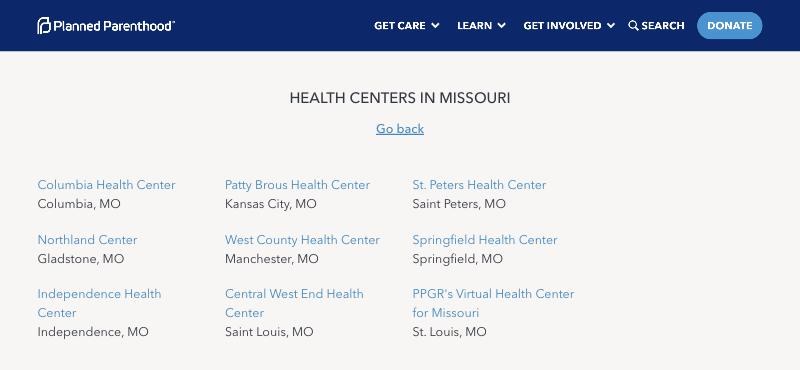
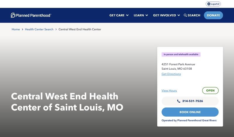
Planned Parenthood’s online booking and two local community health centers, compared step by step.
| Source | Insight | Design response |
|---|---|---|
| Staff | Front-desk staff spent about two hours a day scheduling by phone, and requests on sticky notes or voicemail sometimes went unanswered. | Every request lands in a staff inbox, grouped by status, with one-click call outcomes and up to three follow-up tries. |
| Clients | 7 of 9 people had put off calling because they didn’t want to be overheard or get a voicemail from a clinic. | No voicemail by default, a nickname is enough, Quick exit on every screen, and discreet text reminders. |
| Clients | Most people think about booking in the evening, when the office is closed. | Booking works at any hour, with a “Soonest opening” shortcut. |
| Competitive | Health booking sites lead with a location search, hours, then a grid of open times. | Kept search-first with list and map side by side, but asks for less up front. |
The client flow starts at the homepage button and ends with a person confirming by phone. Rose dashed lines are recovery paths, so nobody hits a dead end.
The first Figma frames mapped the basic path. Reviewing them against the research led to six changes before high fidelity.
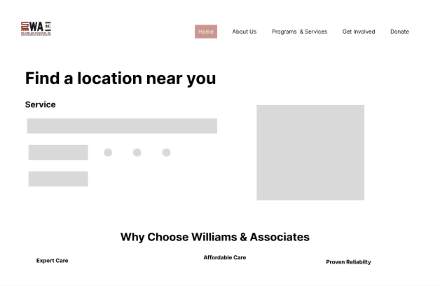
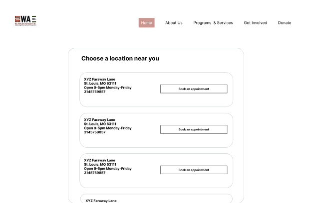
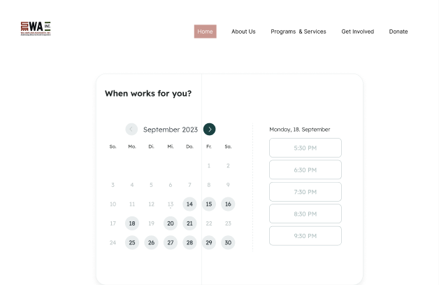
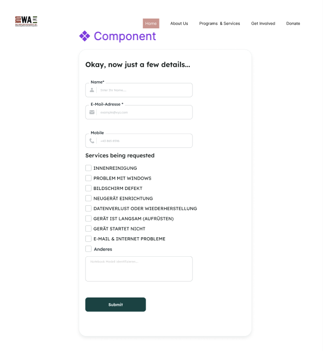
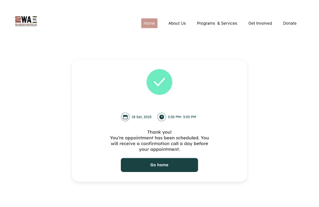
Built on W&A’s existing look: deep teal, the red-bar logo and Lexend. Four booking steps after the homepage, plus a staff inbox.
Service and ZIP code in one row, with "Use my location" · Google Maps view beside the list: numbered markers match the cards, and the selected location opens an info window with Directions · Open-now status and services shown on every card · Phone option stays visible for anyone who'd rather talk
Chosen location stays pinned with a Change link · Only days with openings are active; full and closed days are crossed out · "Soonest opening" shortcut · Times grouped Morning and Afternoon, in Central Time
A name or nickname and a phone number are the only required contact fields · Call or text, voicemail permission (off by default) and best time to reach · Only services offered at the chosen location are listed · Appointment summary and privacy note sit beside the form
Three sections, each with its own Edit link back to that step · Phone number emphasized · A short consent line and a 988 crisis note
Restates date, time and location · Three-step "what happens next" · Reference number and a phone number for changes
Tabs by status with counts, filter by location · "No voicemail" flagged before the worker dials · Log the outcome in one click; the attempt count drives the retry loop
Most people book from their phones. On small screens, open days come first as large tap targets, the map becomes a full-screen view with a bottom sheet, and the main action sits in a bar at the bottom.
Launched in beta on August 3, 2026 at the North City and South City offices:
What changed after beta: Date and time had the highest drop-off (18%), mostly on phones, where the calendar pushed the times below the fold. We moved the times above the calendar and showed the next three open days first. Drop-off at that step fell to 9%.
Privacy choices like the voicemail default mattered more to clients than visual polish. Staff are users too: the inbox decided whether online booking actually saved them time. And the beta caught a phone calendar problem that design reviews missed.
Next steps:
C Dreams trains people for green-collar careers through online courses. I spent 6 months designing the learner dashboard, phone first, before the courses were built.
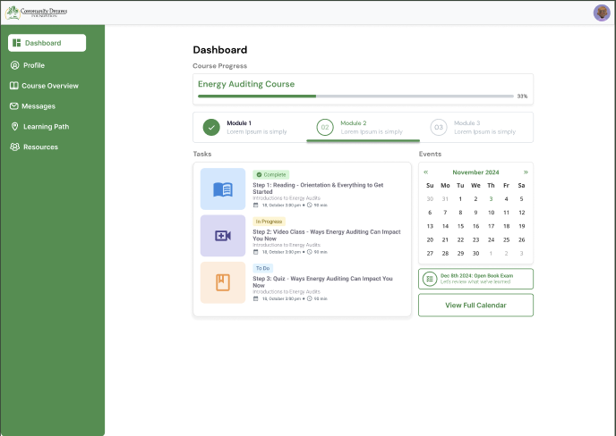
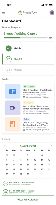
Try it: finish the video, pass the quiz to unlock Module 3, or join the live Q&A. Sample data. Open full screen ↗
Learners study in short bursts on phones and lose track of what's next.
The courses didn't exist yet: just readings, quizzes and maybe live classes.
One dashboard: progress, modules, a task card for any content, and events.
Back in the course in 2 taps, the next task found in under 10 s, and 70% of learners finishing each module.
Career changers are often working or raising kids too. They study in short bursts, mostly on phones. If the app doesn't show what's next, they close it and don't come back.
The twist: the courses didn't exist yet. So the dashboard had to work for any course.
give learners one place to see where they are, what's next and what's coming up, however the course is built?
I set targets first, so every decision had a yardstick.
Targets for learners and for C Dreams.
| Metric | Why it matters | How to measure | Target |
|---|---|---|---|
| Taps to resume learning | The main reason learners open the app | Task flow and usability test | 2 or fewer |
| Find the next task | Is "what's next" clear at a glance? | Usability test: time and success rate | 90% in under 10 s |
| Weekly active learners | Regular short sessions keep people going | Analytics: 1+ task completed that week | 60% of enrolled |
| Module completion | Shows where learners drop out | Analytics: starts vs. finishes | 70% per module |
| Live class attendance | Do events and reminders work? | Registered vs. joined | 75% or more |
| Mobile share of sessions | Checks the phone-first assumption | Analytics: sessions by device | Over half |
| Ease of use (SUS) | A baseline for future versions | Survey after testing | 75 or higher |
We compared three platforms learners already know: how does each answer "where am I?" and "what's next?"
Borrowed: a "resume" that returns you to the exact spot you left.
Borrowed: bite-sized lessons and visible milestones.
Borrowed: a to-do list and calendar side by side.
Learners don't need the whole course on screen. They need the next step, and proof they're making progress.
The dashboard is a summary. Each section links to a full page, so it fits any course length.
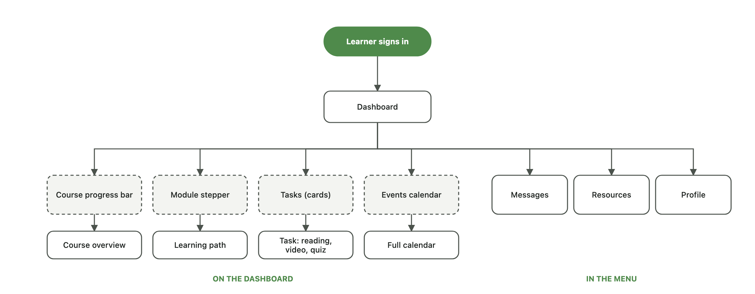
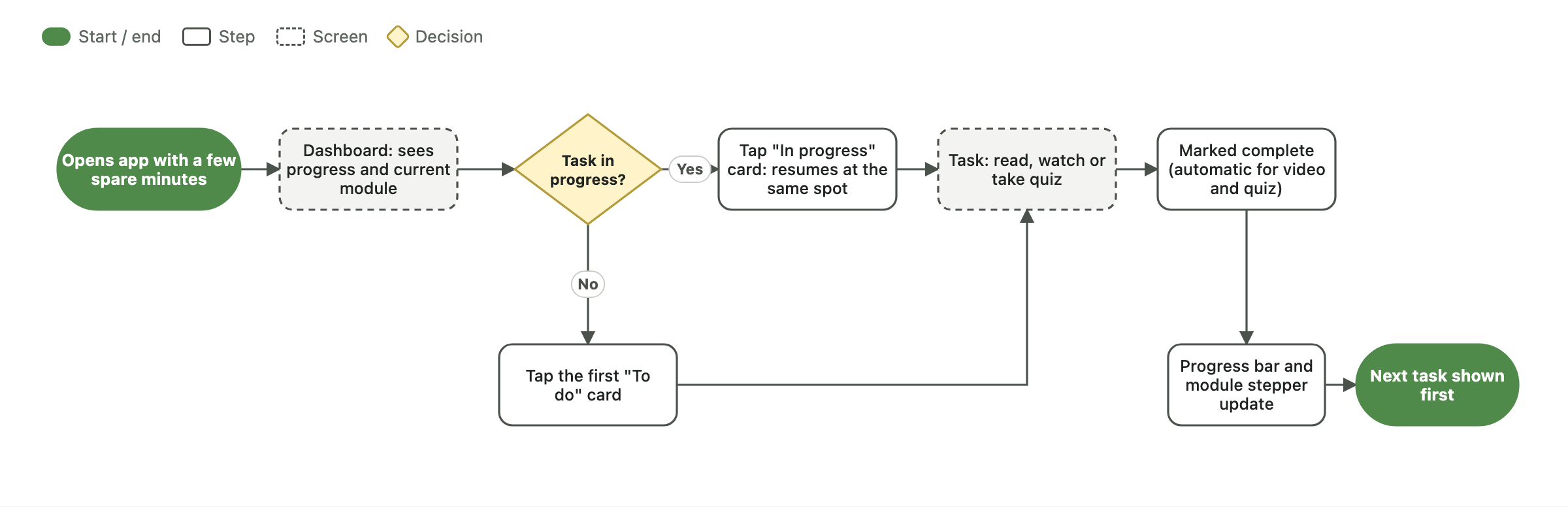
Then the main job: pick up where I left off. It only needs a "next task", never a module count.
Five lo-fi directions, each leading with a different question. None answered all four, so the final design combines the best parts.
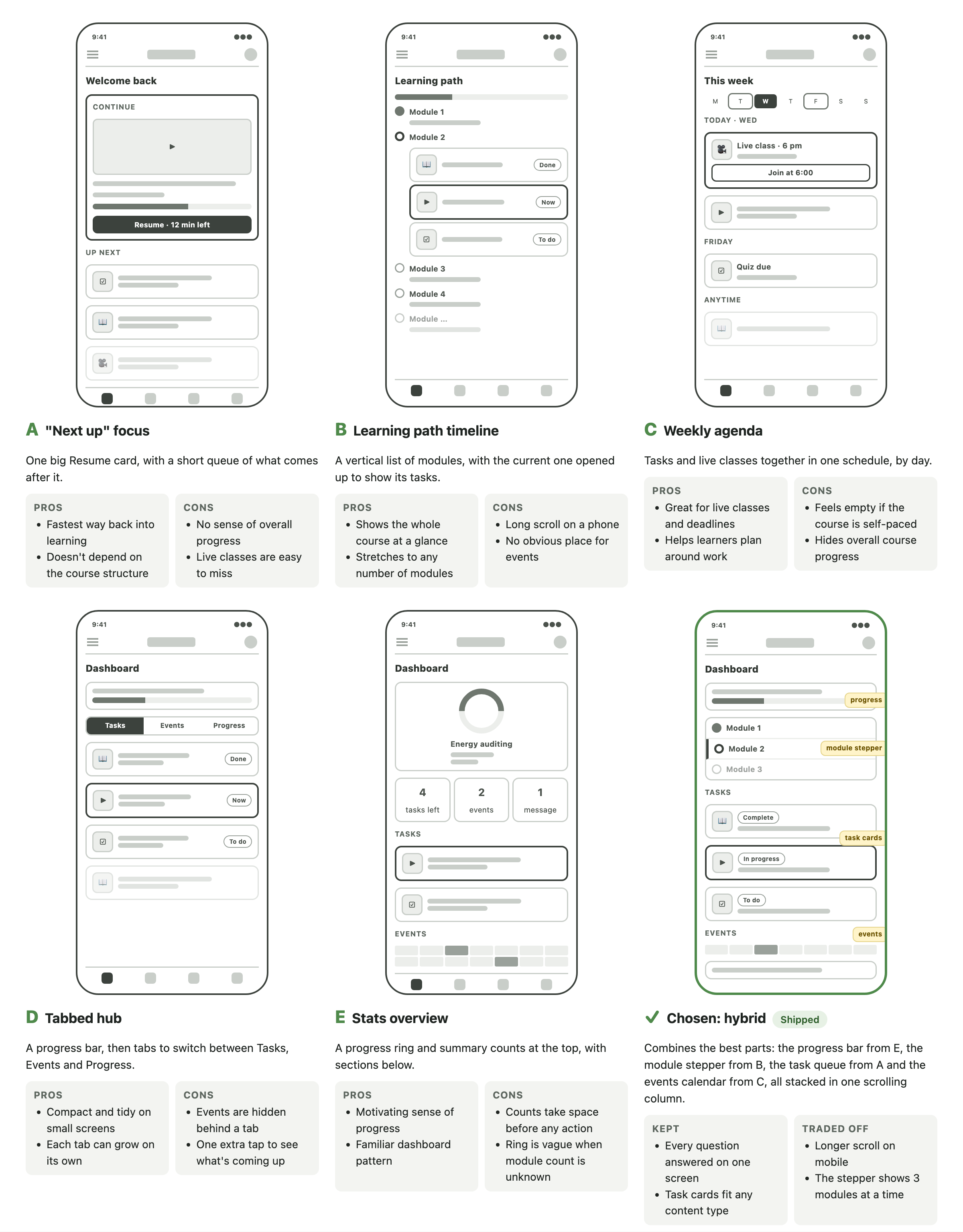
| Criteria | A · Next up | B · Path | C · Agenda | D · Tabs | E · Stats | Hybrid |
|---|---|---|---|---|---|---|
| Works for any course structure | Yes | Partly | Yes | Yes | Partly | Yes |
| Key action in one tap on a phone | Yes | Partly | Yes | Yes | No | Yes |
| Where am I? | No | Yes | No | Partly | Yes | Yes |
| What's next? | Yes | Partly | Yes | Yes | Partly | Yes |
| What's coming up? | No | No | Yes | Partly | Partly | Yes |
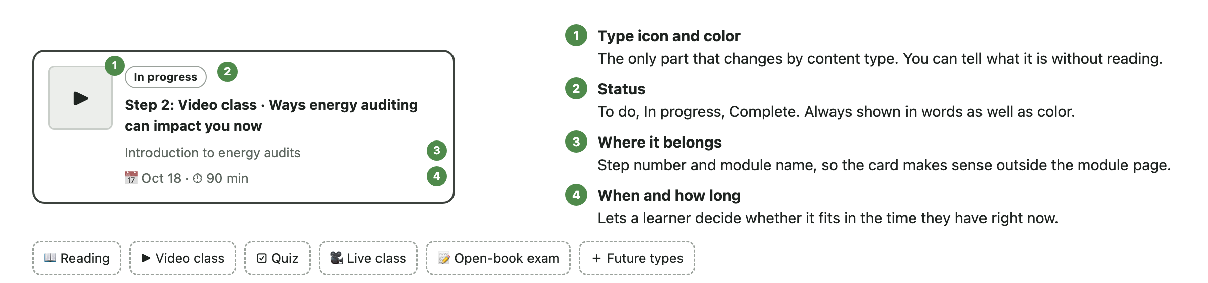
Readings, videos and quizzes share one card. A new content type just needs a new icon.
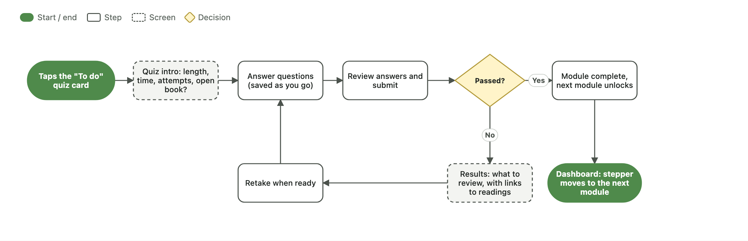
Statuses are spelled out, not just color coded.
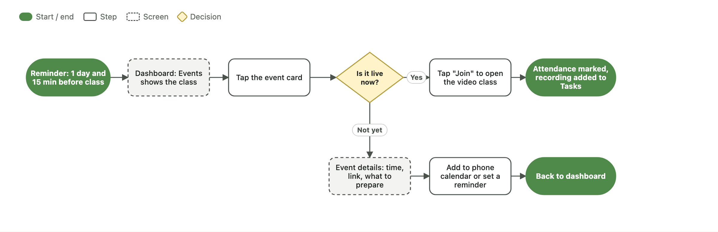
The calendar marks event days; the next event sits below it.
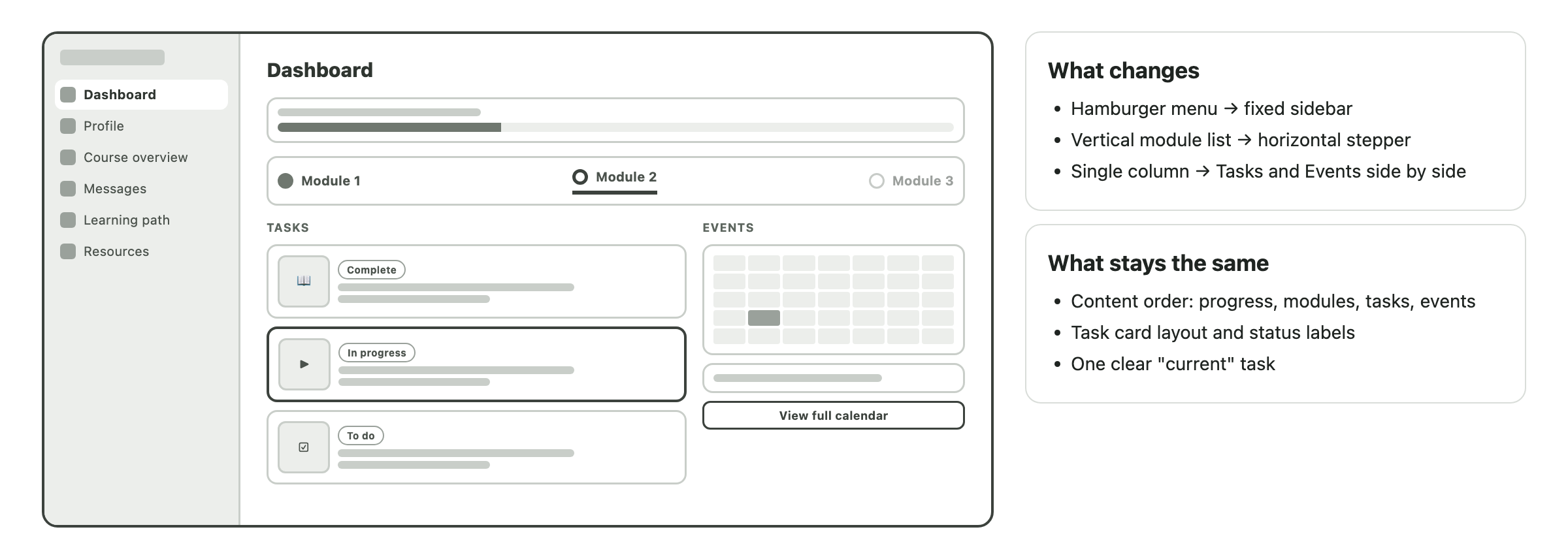
Desktop puts the same blocks side by side.
you made it! 🎉 here's the recap:
What I learned: when the content is unknown, design the system, not the screen.
Better Days Divine is a community wellness nonprofit in St. Louis. Four kinds of people needed to use its CRM, and their days look nothing alike. I met with each type of user, asked what their core duties are and what they need to do them, then designed four flows on top of one shared system.
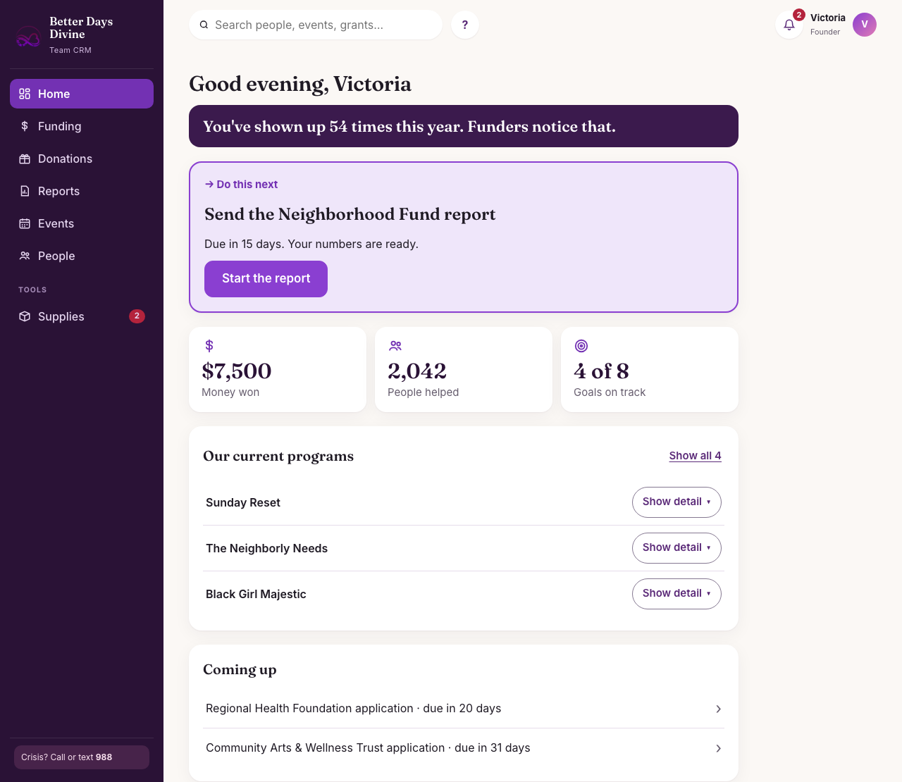
Try each flow: switch roles above and follow the steps in the journeys below. Sample data. Open full screen ↗
Create four flows on one CRM without completely reinventing the wheel for each person.
Met with all four types of users and asked about their core duties and what they need to perform them.
It has to work for ages 5 to 75, on a phone, outdoors, with no training.
One shared event record and one set of reusable pieces, arranged into a flow for each role.
I needed to create four flows on the CRM, one for each kind of person using it, without completely reinventing the wheel.
Four separate experiences would mean four things to learn and maintain, and the numbers from an event would never meet up. One identical screen for everybody would bury a one-day helper in grant deadlines.
give four very different people a flow that fits their job, while building as little new as possible?
Before designing anything, I met with the four types of individuals who would be using the CRM. I asked each of them the same two things:
Two ways. I leaned on patterns people already know from other CRMs, and I built each piece once so all four flows could share it.
Which home screen you land on, how many places you can go (the founder has 7, a facilitator 5, a volunteer and a helper have 1 screen each), and whether it is designed for a desk or a phone.
Each role adds its piece to the same event, and nothing gets typed twice.
My first version had everything on it, and in review the note was simple: “this just seems cluttered.” So I walked all 16 screens one role at a time. Every screen in all four flows now passes the same rules.
Everything else looks secondary or folds away.
Status is always written out, never a colored dot alone.
Text 15px or larger, buttons 44px, counting buttons 56px.
Long forms became 3 tap-only steps with Back always there.
What they doOpens Home.
What the CRM doesLeads with one “Do this next” card, such as a report that is due, above progress and programs.
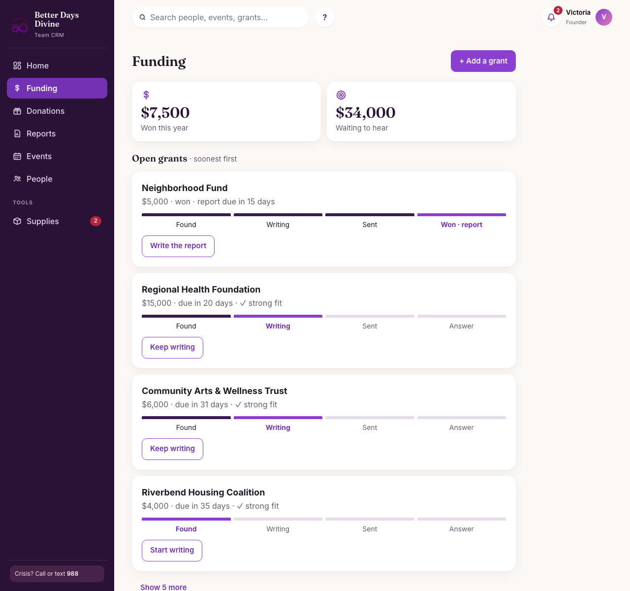
What they doOpens Funding.
What the CRM doesShows grant cards on a Found → Writing → Sent → Answer path, and flags strong fits.
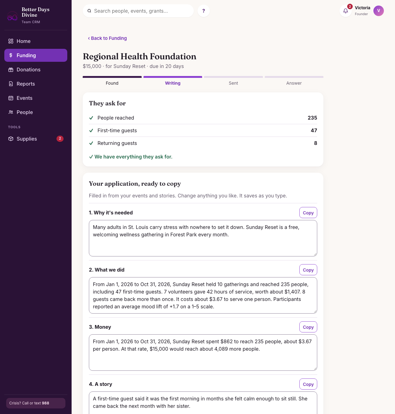
What they doOpens one grant.
What the CRM doesLists what the funder asks for next to the real numbers, and says what to start counting if something is missing.
What they doReads, edits and copies each part.
What the CRM doesFills in why it’s needed, what we did, money and a story from closed-out events. Saves while typing.
What they doSubmits it, then moves the grant forward.
What the CRM doesOne button names the next step, and deadlines show up as reminders.
What they doAnswers three tap-only steps: which program, when and where, look good?
What the CRM doesSuggests days and places, and fills in goals for that program.
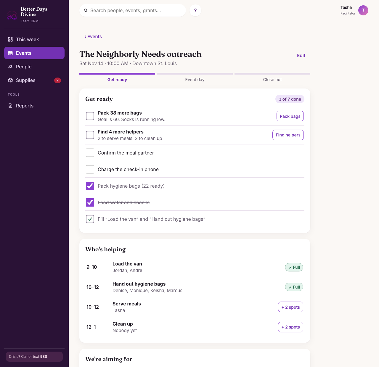
What they doWorks down the Get ready list.
What the CRM doesFlags open shifts with a Find helpers button, and bags still to pack.
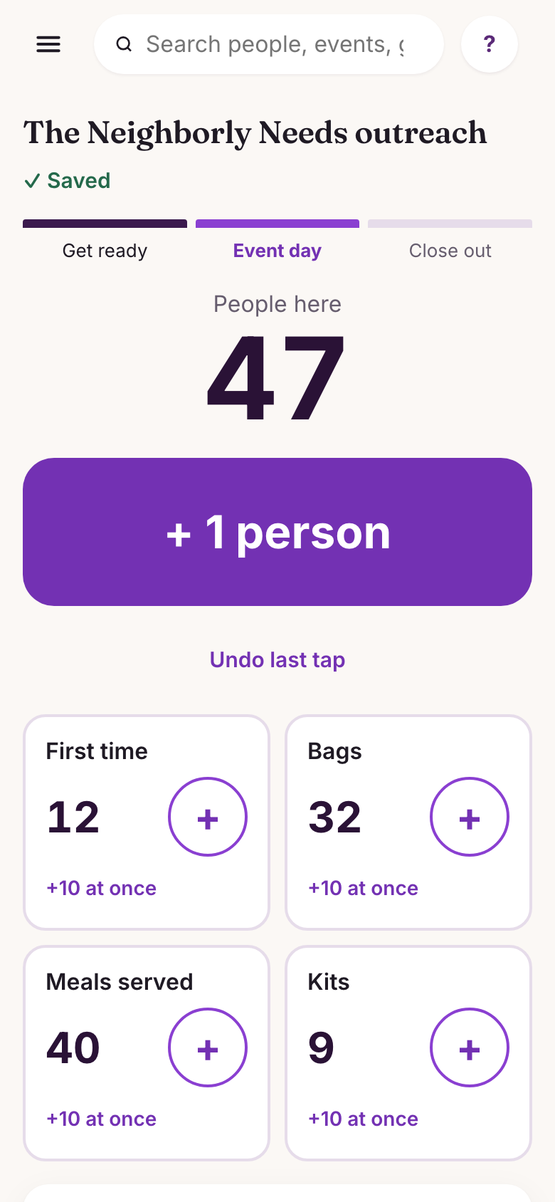
What they doTaps Start event day and counts on a phone.
What the CRM doesGives one giant + button and Undo, with tiles only for what that program hands out.
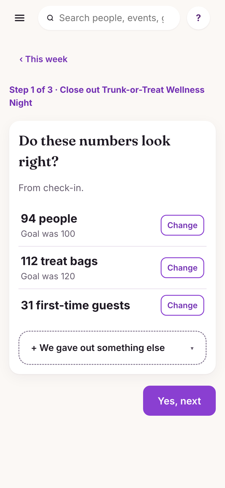
What they doConfirms the numbers, who helped and how it went.
What the CRM doesStarts from check-in counts and shift hours, and shows the note left last time.
What they doTaps Close out and is done.
What the CRM doesSends the numbers to reports and grants, the story to the story bank, and a thank-you to helpers.
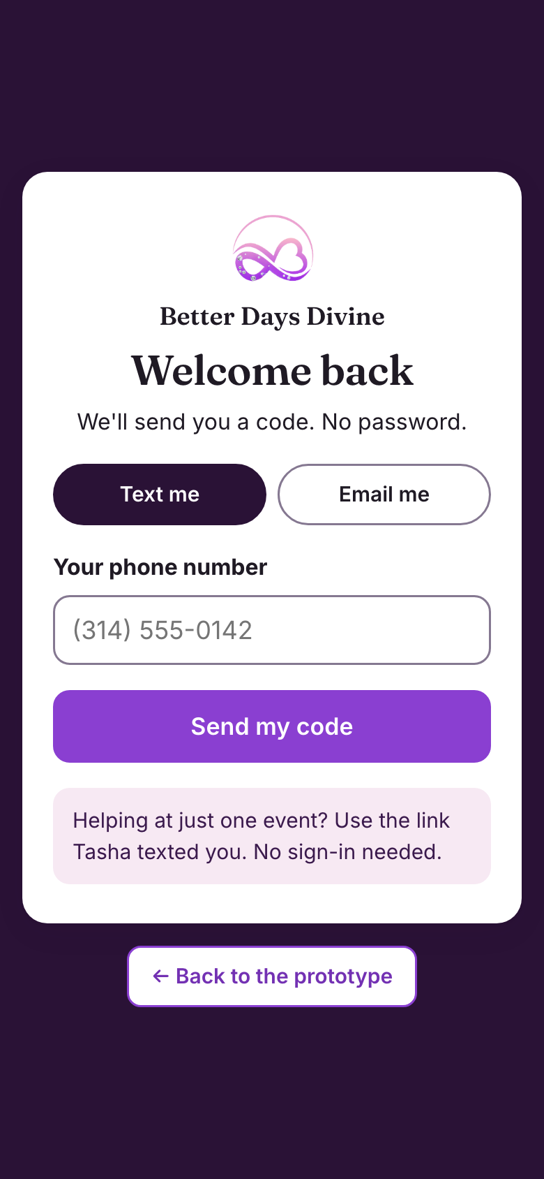
What they doAsks for a code by text or email.
What the CRM doesSkips the password completely.
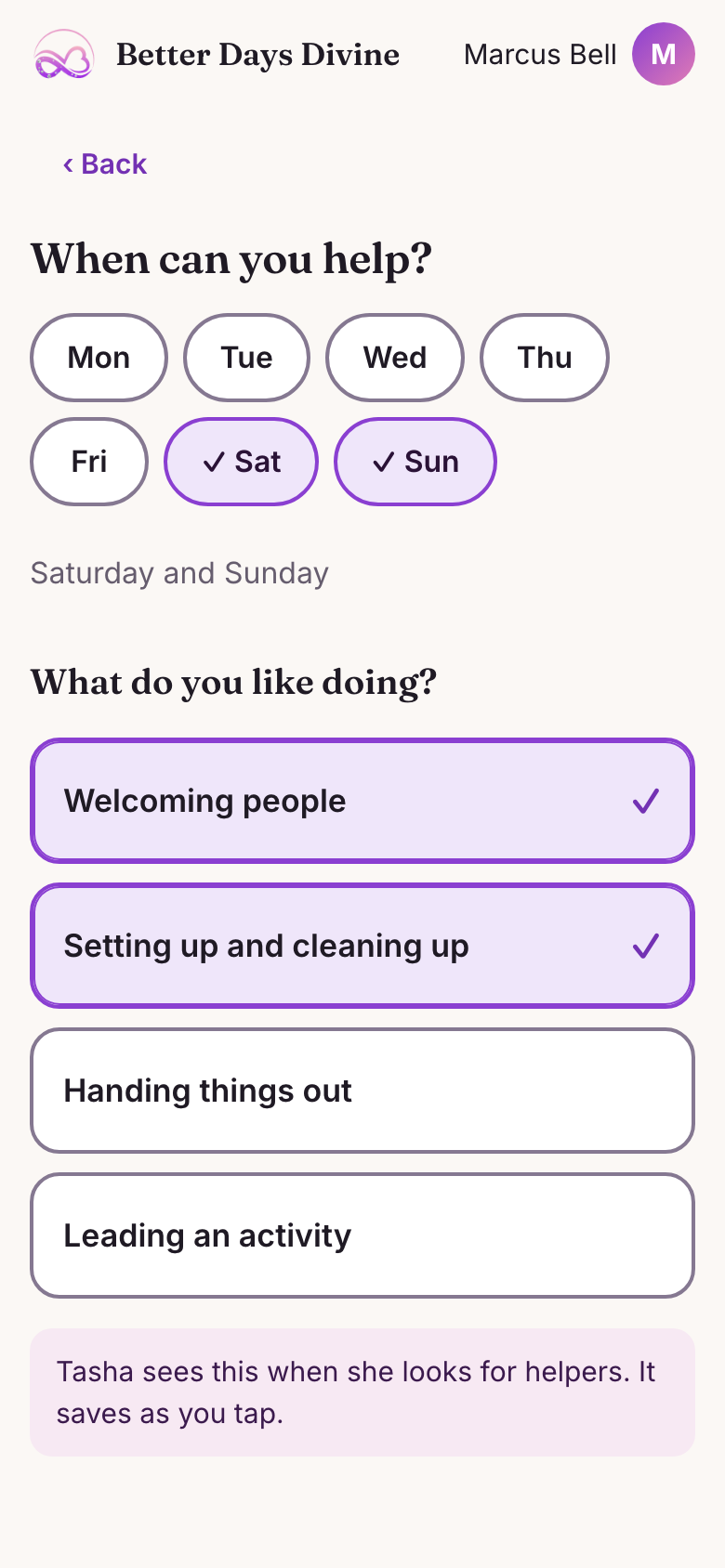
What they doTaps days of the week and what they like doing.
What the CRM doesUses those answers to suggest open shifts.
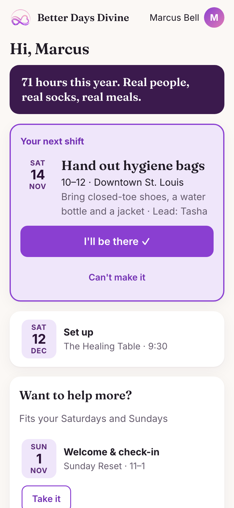
What they doTaps “I’ll be there” or “Can’t make it.”
What the CRM doesShows the role, time, place, what to bring and who leads.
What they doTaps “Take it” on an open shift.
What the CRM doesFills the spot on the facilitator’s helper list.
What they doTaps “I’m here.”
What the CRM doesLogs the time, ready for close-out.
What they doChecks My hours.
What the CRM doesShows progress to the next badge and offers an hours letter.
What they doTaps the link in a text.
What the CRM doesOpens one screen, with no password or account.
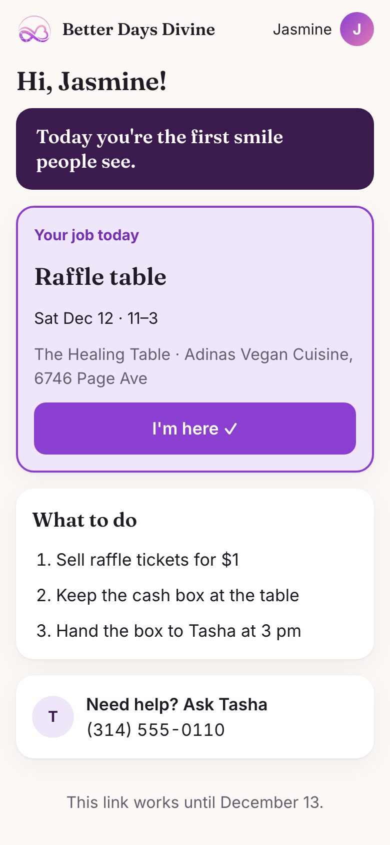
What they doReads “Your job today.”
What the CRM doesShows the role, time and place.
What they doTaps “I’m here.”
What the CRM doesLogs the time, so the facilitator doesn’t have to.
What they doFollows three numbered steps.
What the CRM doesWrites the steps for that role. Welcome-table helpers also get the people counter.
What they doCalls or texts the lead if stuck.
What the CRM doesKeeps the facilitator’s phone number on the screen.
What they doGoes home.
What the CRM doesEnds the link’s access 24 hours after the event.
you made it! 🎉 here's the recap:
Checked against WCAG 2.2 AA while building: color contrast, 320px phone width, labels on every field, and status in words. A test with real users and a screen reader comes next.
What I learned: the more people a tool serves, the less each screen should do.
Pick a site and watch the tour. Each highlight is a design choice, labeled with the growth it’s built for.