A learner dashboard designed before the courses existed
How I designed one dashboard that works for any course, phone first.
C Dreams trains people for green-collar careers through online courses
Online courses like Energy Auditing that lead to green-collar jobs.
5 UX/UI designers, each owning a part of the platform.
The learner dashboard: the first screen learners see every time.
Four questions the dashboard must answer
give learners one place to see where they are, what's next and what's coming up, however the course is built?
I set targets first, so every decision had a yardstick
Also tracked: weekly active learners (60%), mobile share of sessions (over half), ease of use (SUS 75+).
What we borrowed from platforms learners already know
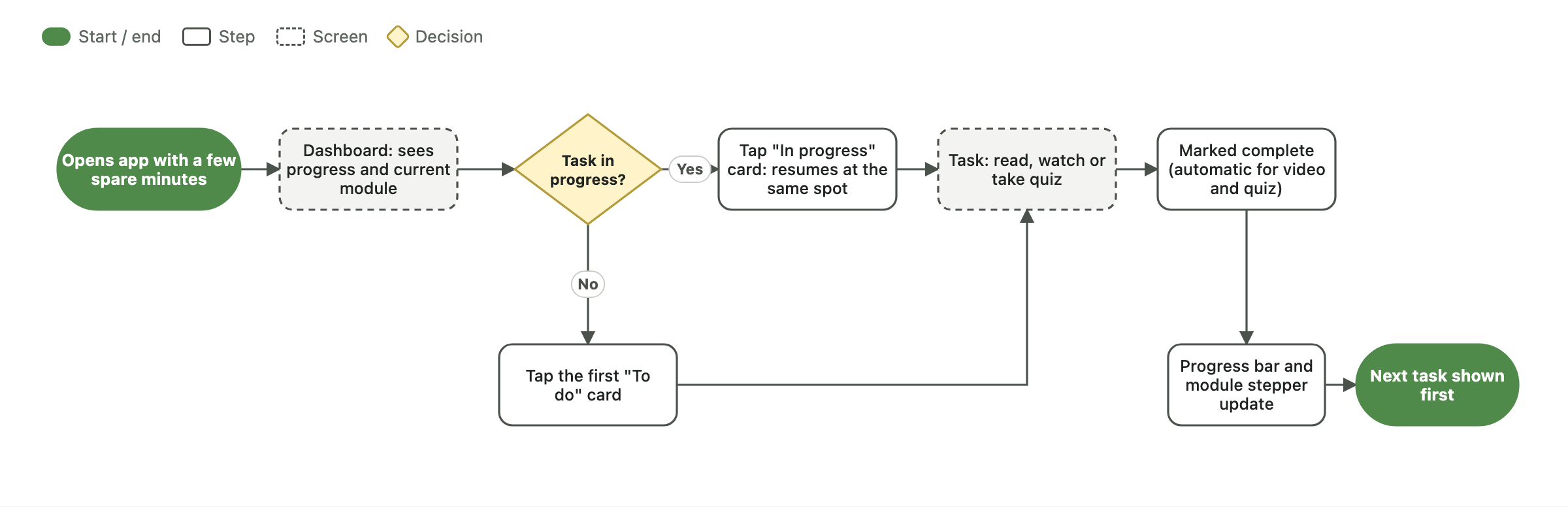
A "resume" that returns you to the exact spot you left.
Bite-sized lessons and visible milestones.
A to-do list and calendar side by side.
Learners don't need the whole course on screen. They need the next step, and proof they're making progress.
The dashboard is a summary: each section links to a full page, so it fits any course length
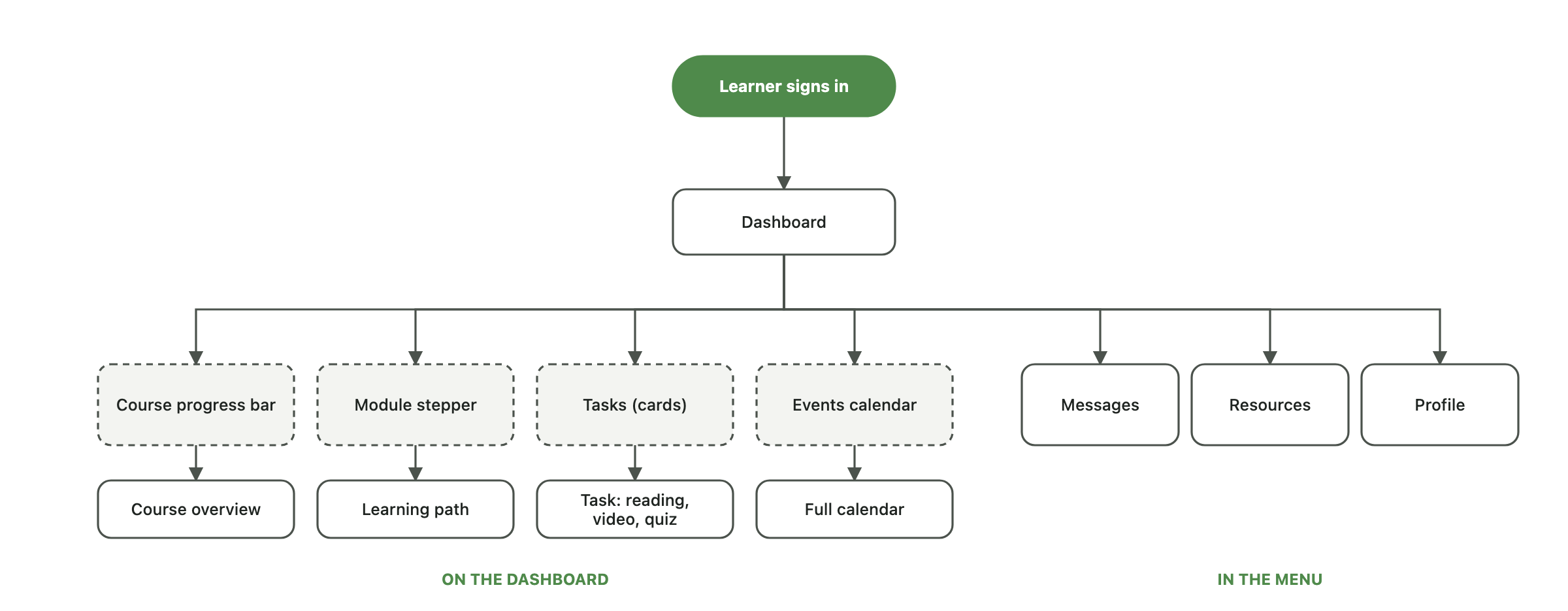
The main job: pick up where I left off. It only needs a "next task", never a module count
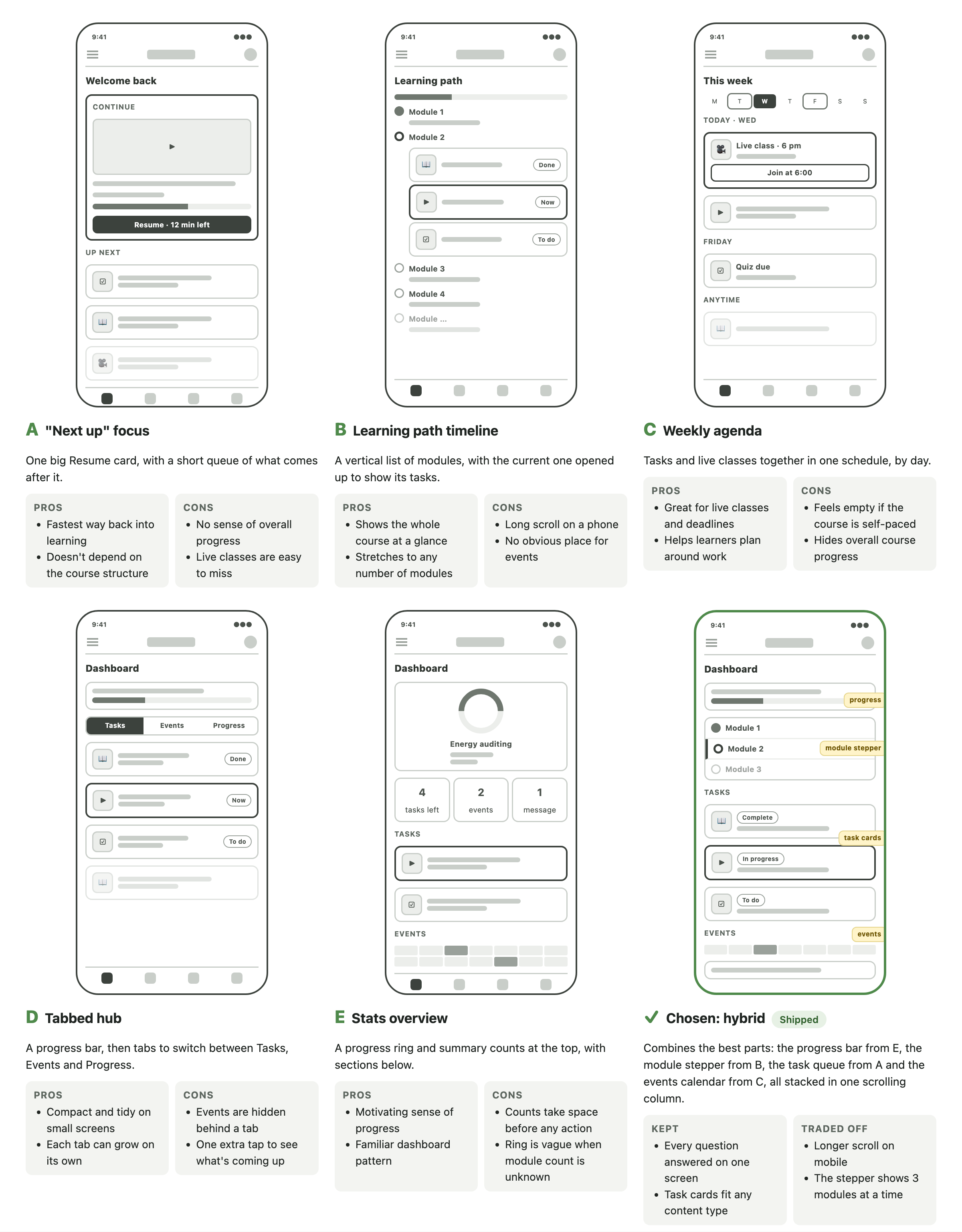
Five directions, each leading with a different question
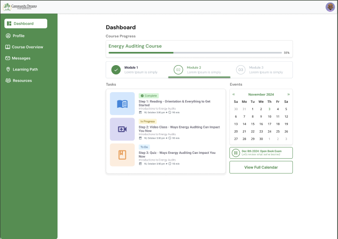
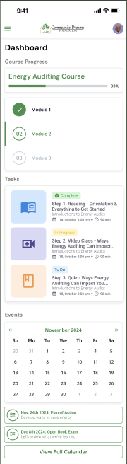
None answered all four questions, so the final design combines the best parts: a progress bar, module stepper, task cards and an events calendar.
Four key decisions
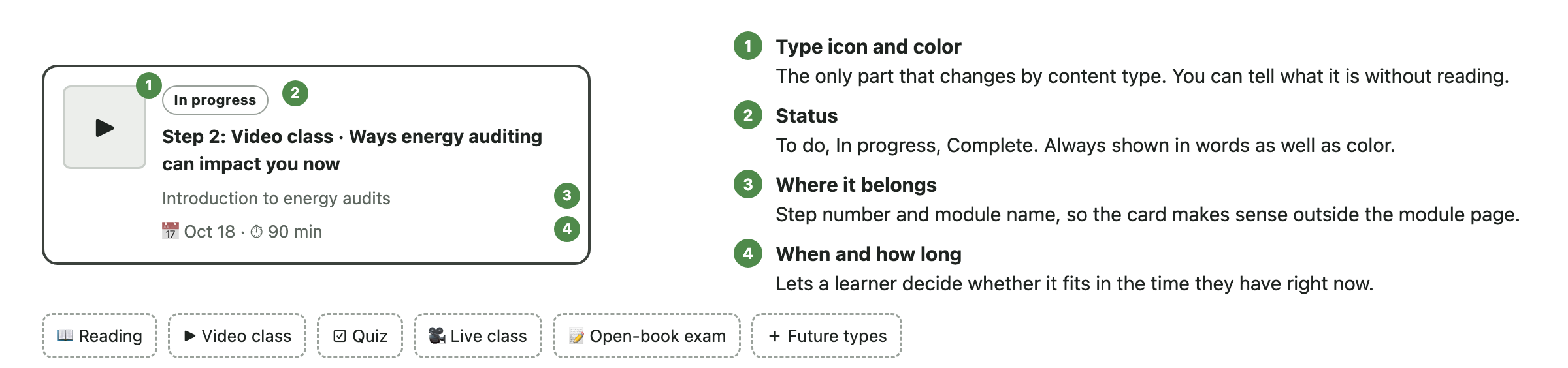
Readings, videos and quizzes share one card. A new content type just needs a new icon.
Statuses are spelled out, not just color coded.
The calendar marks event days; the next event sits below it.
Desktop puts the same blocks side by side.
One card, every content type


Finish the video, pass the quiz, unlock Module 3
Try the live prototype at gabbiehullux.netlify.app/prototype/c-dreams.html
The recap
When the content is unknown, design the system, not the screen.
Questions?
Gabrielle Hull · UX/UI Designer